Card Deck Web Component
I recently published the first stable release of <card-deck>, a Web Component for swipeable card interfaces inspired by Tinder’s iconic interaction model.
This component is:
- ✅ Fully native (uses the Web Components standard)
- ⚡️ Lightweight and fast
- 📦 Zero dependencies
- 💅 Customizable via CSS variables
- 🧠 Controllable via JavaScript
In this post, I’ll walk you through how to use the component, and give you insight into how it was designed and built.
🛠️ Installation and Setup
To get started, simply include the styles and script in your HTML:
<link rel="stylesheet" href="@salvador/card-deck/dist/style.min.css" />
<script type="module" src="@salvador/card-deck/index.min.js"></script>
Or, if you’re using a modern frontend setup with bundling, import it in your JavaScript:
import "@salvadorsru/card-deck";
⚠️ Note: The JS import does not include styles — you must still add the CSS manually from the
distfolder.
🚀 Basic Usage
Creating a deck of cards is as simple as wrapping elements inside <card-deck>:
<card-deck>
  <div class="card">Card 1</div>
  <div class="card">Card 2</div>
  <div class="card">Card 3</div>
</card-deck>
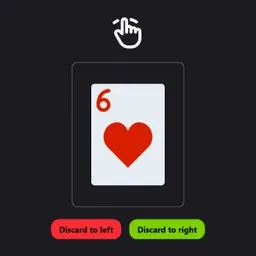
Each child inside the deck is treated as a swipeable card. You can swipe cards left, right, up, or down — and they animate out of view accordingly.
🧩 Programmatic Control
You can also control the deck from your code. The component exports helpers via the emulate module:
import { discardToRight, discardToLeft } from "@salvadorsru/card-deck/emulate";

const $deck = document.querySelector("card-deck");

discardToRight($deck);
// or
discardToLeft($deck);
This is useful for scenarios like quizzes or games where user actions control the swipe behavior.
📡 Events
The <card-deck> component emits two main events:
discard
Emitted immediately when the user swipes a card away.
cardRemoved
Emitted after the card has been fully removed (including animation and DOM removal).
deck.addEventListener("discard", (e) => {
  console.log("Swiped!", e.detail);
});

deck.addEventListener("cardRemoved", (e) => {
  console.log("Card removed", e.detail.card);
});
e.detail contains:
goRight:trueif card was swiped rightgoDown:trueif card was swiped downcard: reference to the HTML element of the card
🎨 Customization with CSS Variables
The appearance and behavior can be tweaked via CSS variables:
card-deck {
  --card-width: 200px;
  --card-height: 280px;
  --transition-time: 0.4s;
}
Available variables include:
--card-width,--card-height,--card-ratio--transition-time,--transition-opacity,--transition-rotation
This gives you full control over the card size and animation speed without changing the core code.
🧱 How It Works Under the Hood
This component is built using vanilla JavaScript and the native Custom Elements API. Here’s a breakdown of the core concepts:
- Each card listens for pointer movements (drag/swipe)
- The top card gets
draggedand directional classes like.to-left,.to-right, etc. - Animations are triggered via CSS transitions
- When released, the component decides whether to reset the position or discard the card
- Discarded cards are animated out and removed from the DOM
- All state is managed internally, making it very easy to drop into any HTML page
No frameworks, no dependencies, and works on any evergreen browser.
📺 Live Demo
You can test it out here: 👉 swipeable-card-deck.vercel.app
🤝 Final Thoughts
<card-deck> is still evolving, but it’s ready for use in production apps where you need a swipeable interface — think product selectors, quizzes, games, or profile cards.
I’d love to hear your feedback, bug reports, or feature ideas — feel free to open an issue or reach out on social media.
Thanks for reading!